
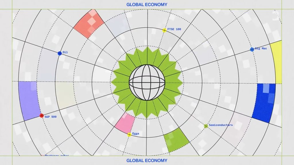
We initially hesitated to produce this piece, recognizing the challenge of making a theoretical story visually engaging. Our solution was to develop a creative graphical design language that used shapes and colours to act as visual representations of these complex ideas. By using everyday shapes like circles, asterisks, squares and ovals, we were able to create a visual formula that pieced together the various elements at play, with each shape standing in to represent the different factors that influence the price of money.
The Motion Design system built from abstract shapes was intentionally paired with the creative use of old 70’s and 80’s archival, in order to humanize the underlying editorial narrative that at its core is quite mathematical. We employed this creative technique to ensure that the ultimate end result of the video would have maximum impact for all viewers regardless of their financial literacy.